14-09-25
SWAY
SWAY is a new cocktail bar concept built around storytelling and craftsmanship—sophisticated yet welcoming. The name itself points to the values: Storytelling, Well-crafted, Ambitious, You.
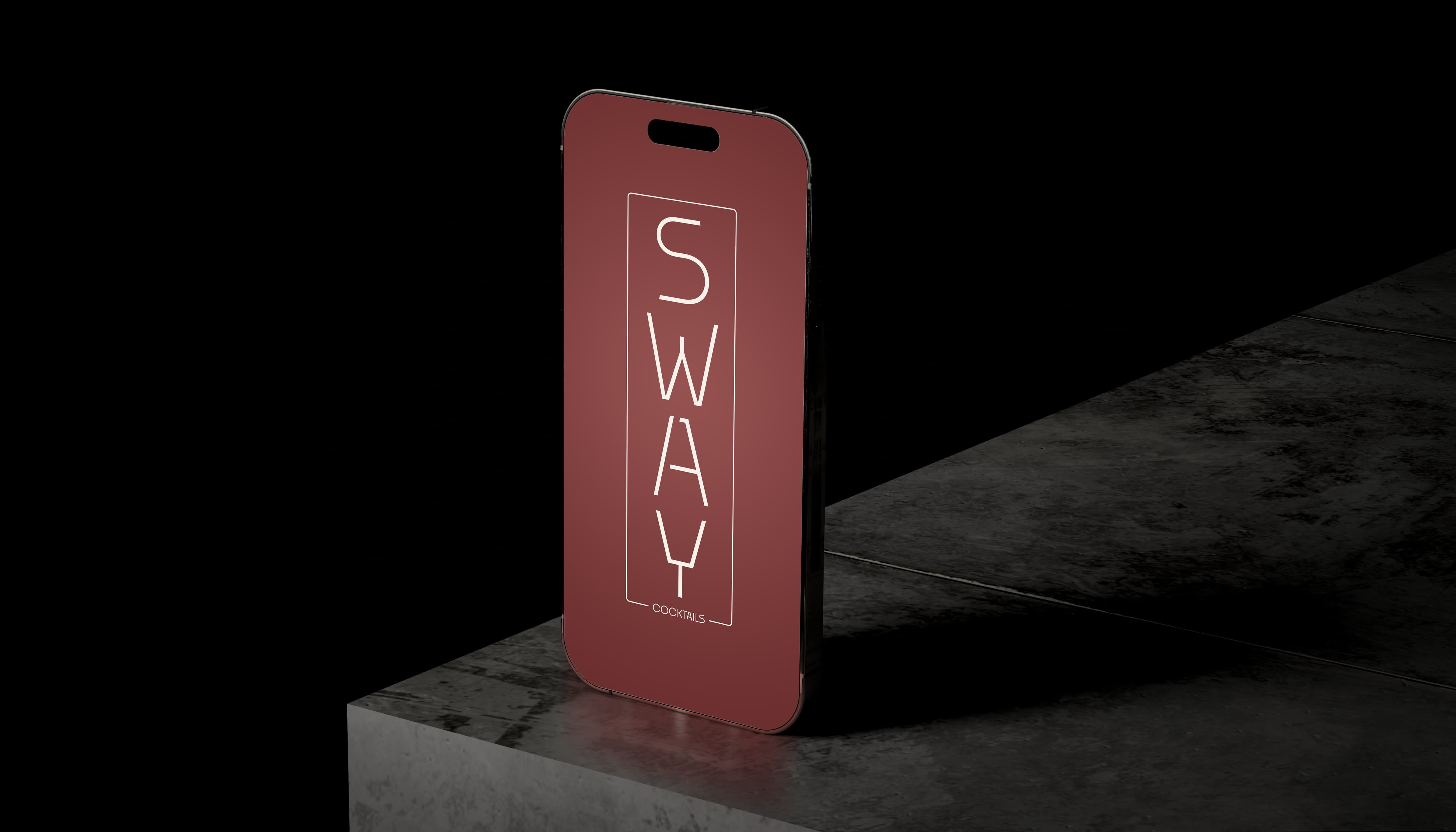
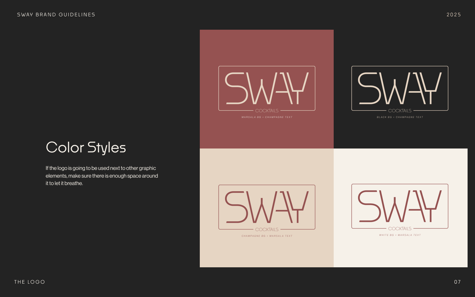
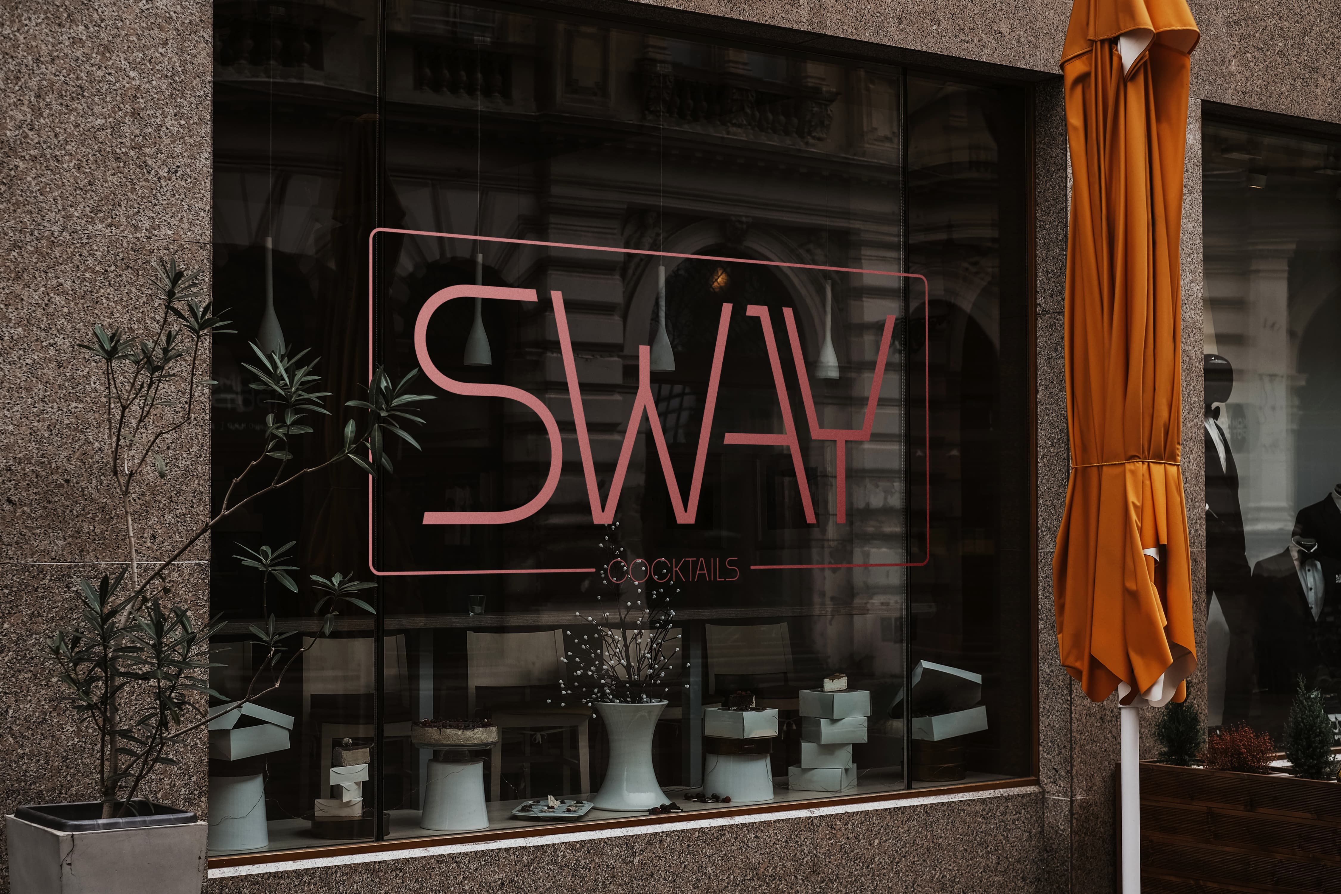
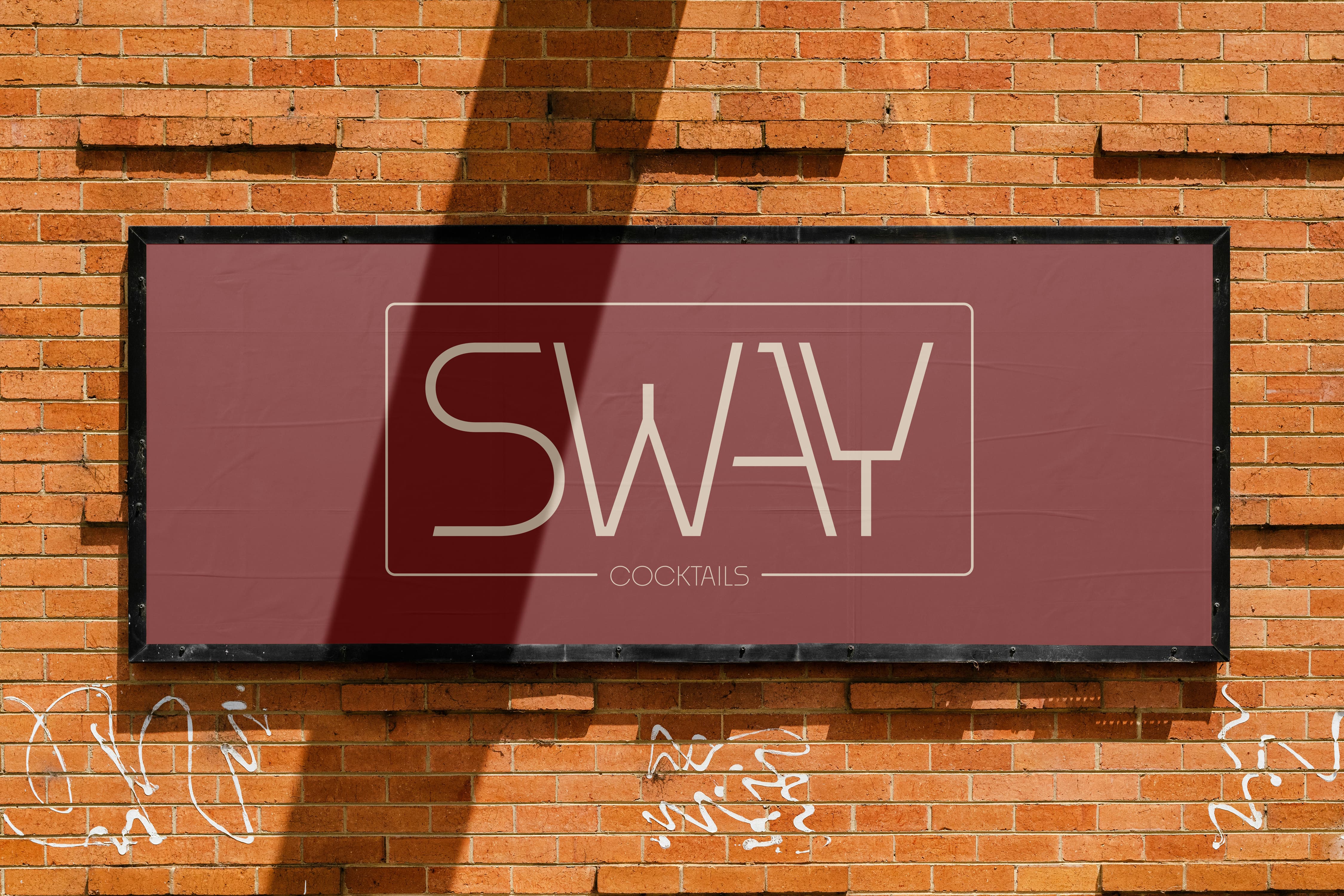
I designed a minimal, typography-driven wordmark and a flexible family of lockups, then codified them into lightweight brand guidelines with clear usage recommendations. The SWAY COCKTAILS lockup is the primary mark, setting a calm, confident tone that feels premium without pretense.
I designed a minimal, typography-driven wordmark and a flexible family of lockups, then codified them into lightweight brand guidelines with clear usage recommendations. The SWAY COCKTAILS lockup is the primary mark, setting a calm, confident tone that feels premium without pretense.
Context
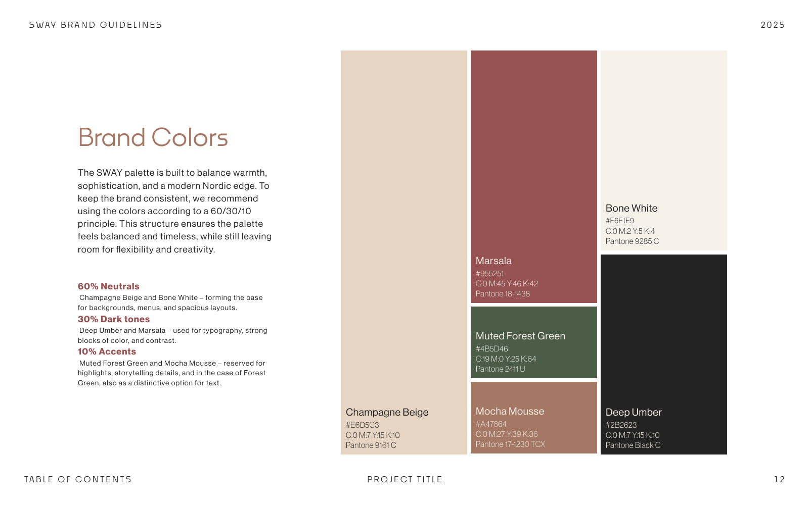
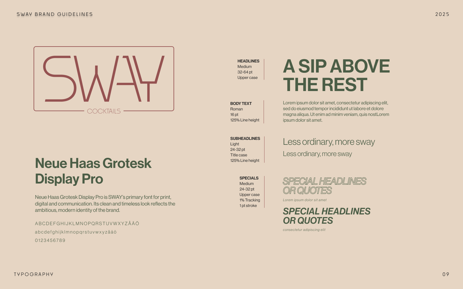
SWAY positions itself as a crafted yet friendly destination in Gothenburg’s cocktail scene. The brand language is intentionally minimal and professional, with warmth carried by tone and rhythm rather than ornament. The identity had to read clearly in low-light environments and scale across signage, menus, and digital touchpoints.
Scope
I designed the logotype and identity system, finalized a compact set of lockups (horizontal/vertical, framed/unframed) with COCKTAILS as the master, and delivered lightweight guidelines covering usage, clearspace, color/type, scaling, and do’s/don’ts. I also produced application mockups for signage, menus, and social.
Tech stack
Illustrator
Figma
Photoshop
ChatGPT
Figma
Photoshop
ChatGPT
Mission
Create a timeless identity for a modern cocktail bar—elegant, sober, and approachable. The brand needed to read clearly on signage, menus, and screens, and feel at home in both intimate and energetic settings.
Challenge
We explored illustrative ideas early on, but deliberately moved away from them. The challenge was to achieve character and recognition through restraint—pure typography, precise spacing, and a system of lockups that works at every scale, without relying on a symbol.
Outcome
The identity is clean, confident, and versatile. The master lockup anchors the system, while the guidelines give the team a simple reference to keep roll-out consistent across print and digital—premium without pretense.

.jpg)