16-03-26
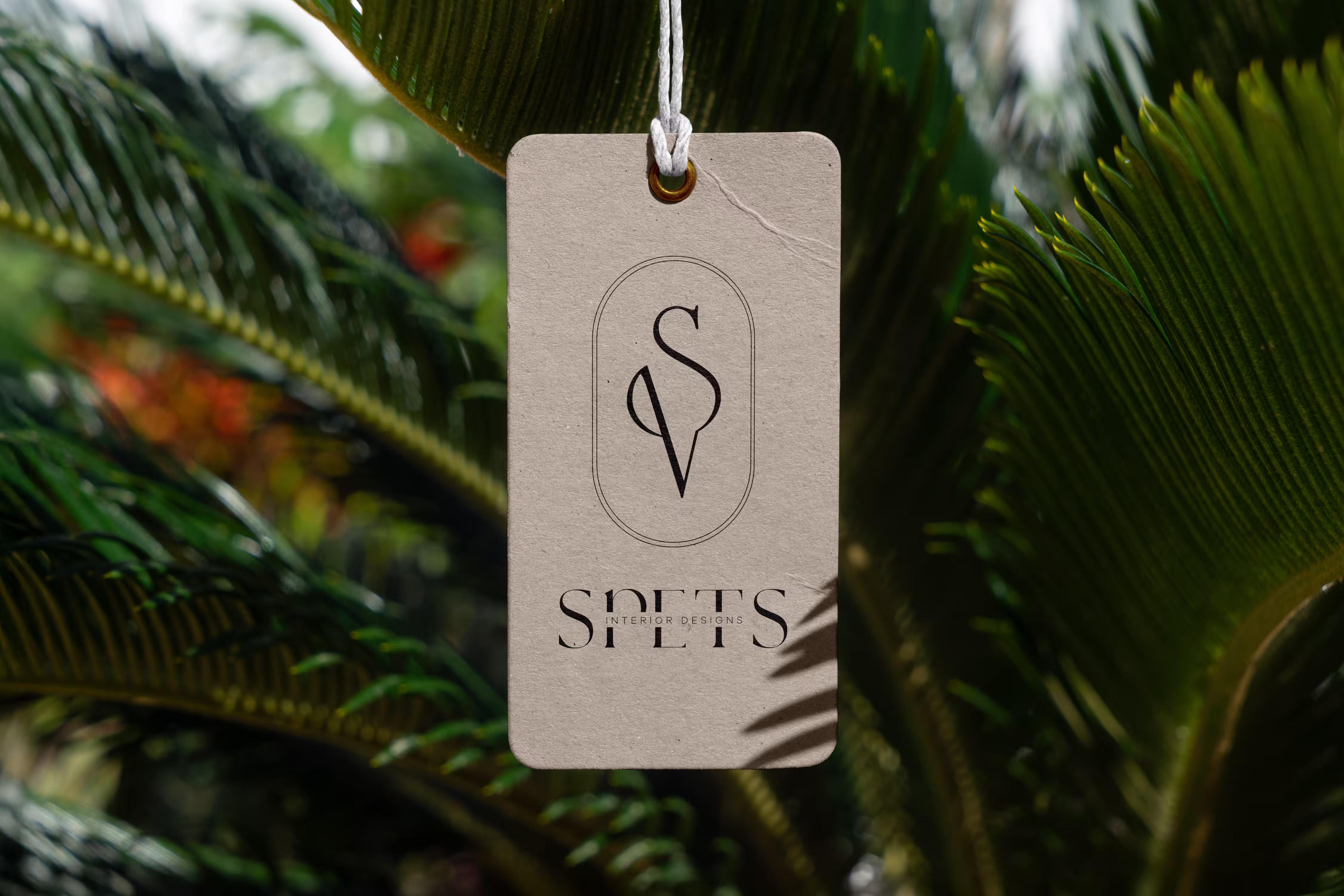
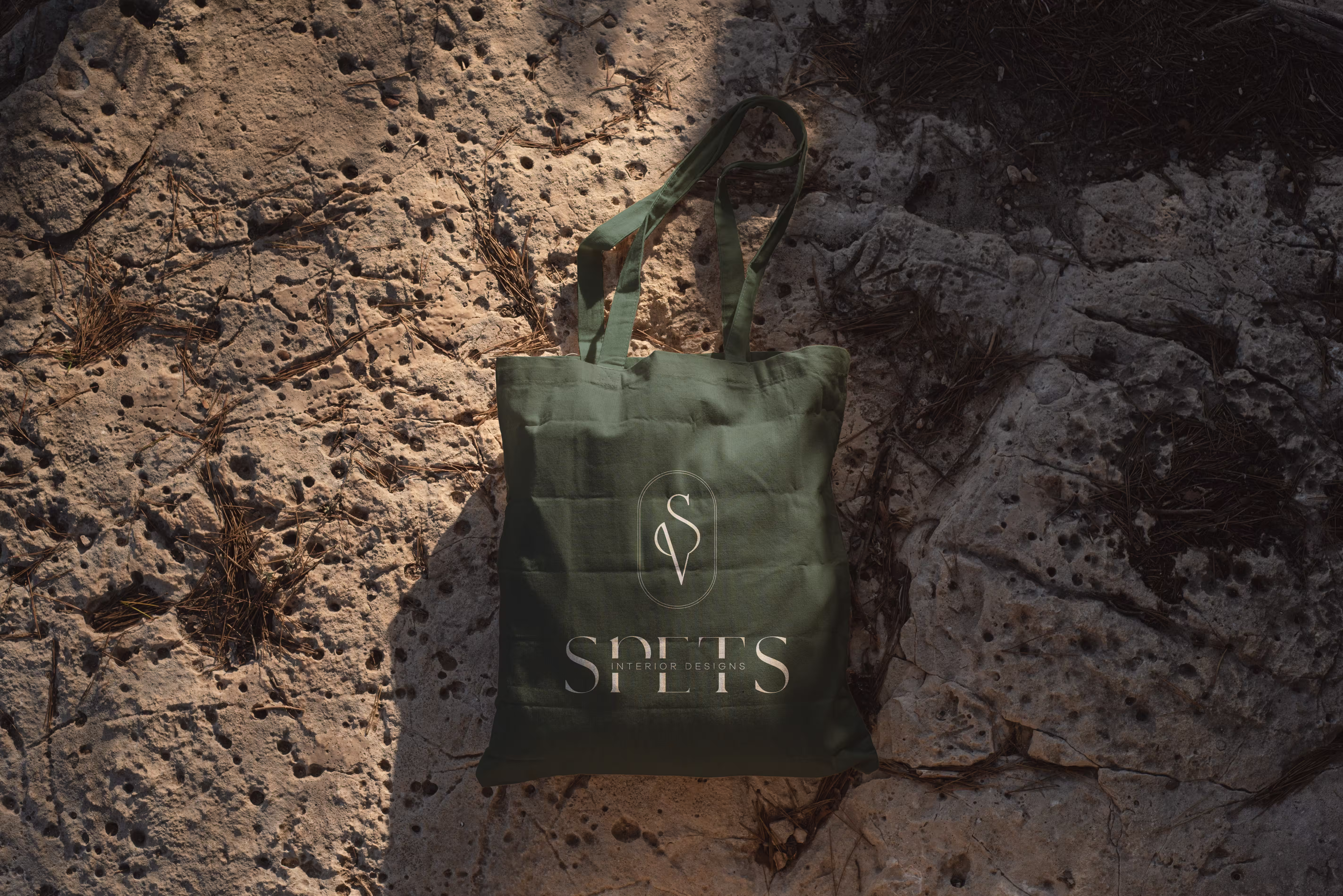
SPETS
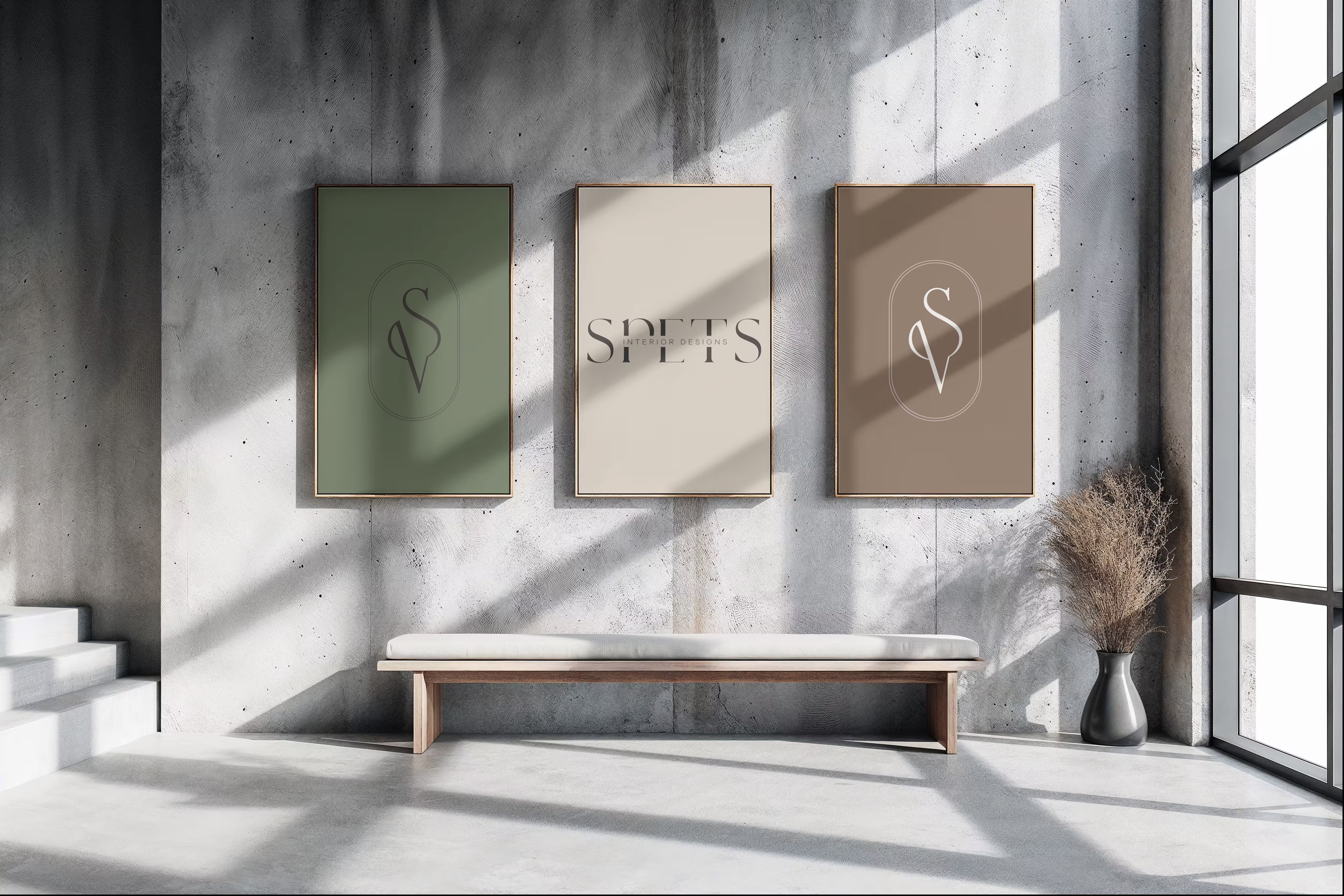
SPETS is an interior design studio with a calm and considered expression. The identity was developed to reflect that same feeling — understated, balanced, and clear, with enough character to feel distinctive without becoming loud.
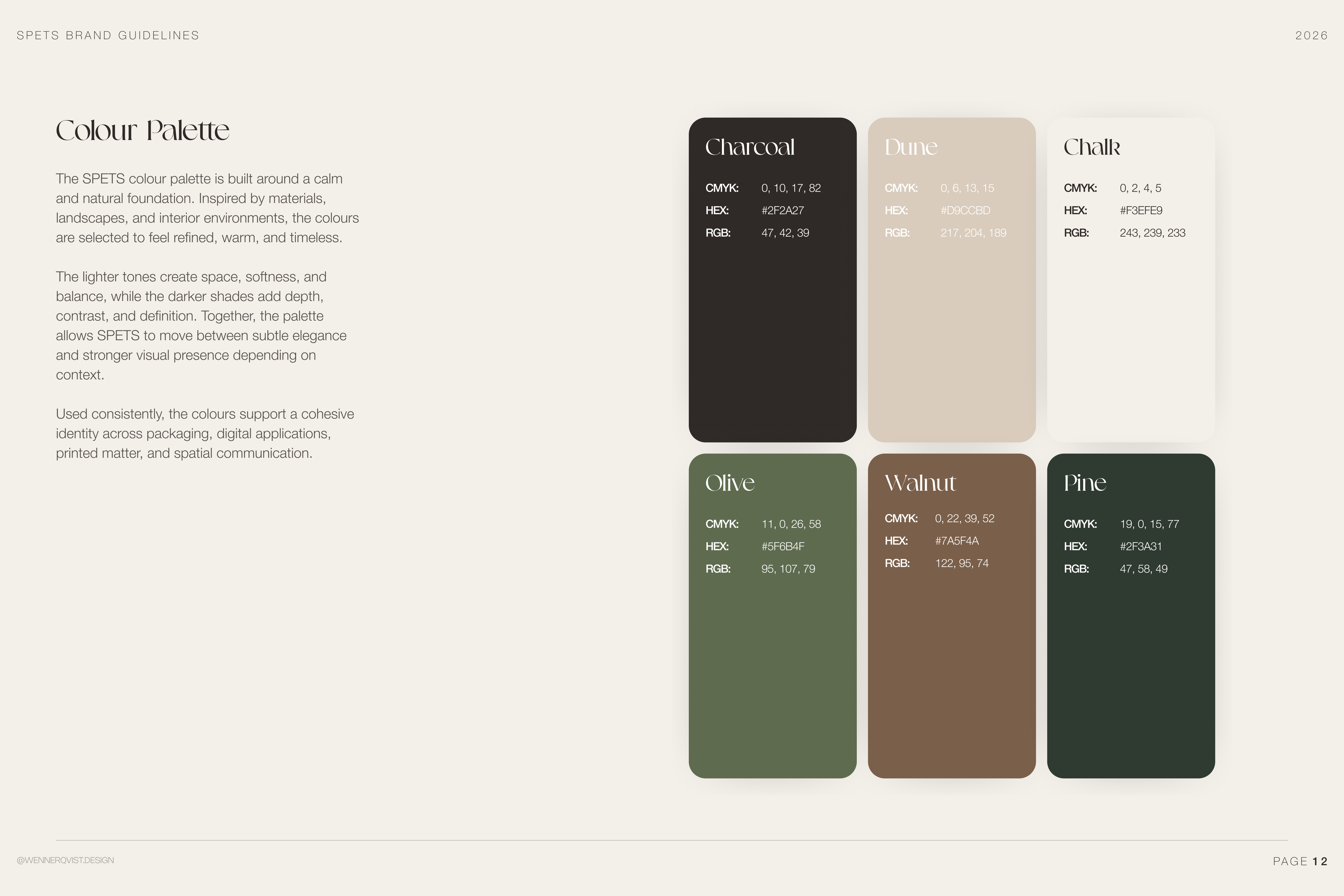
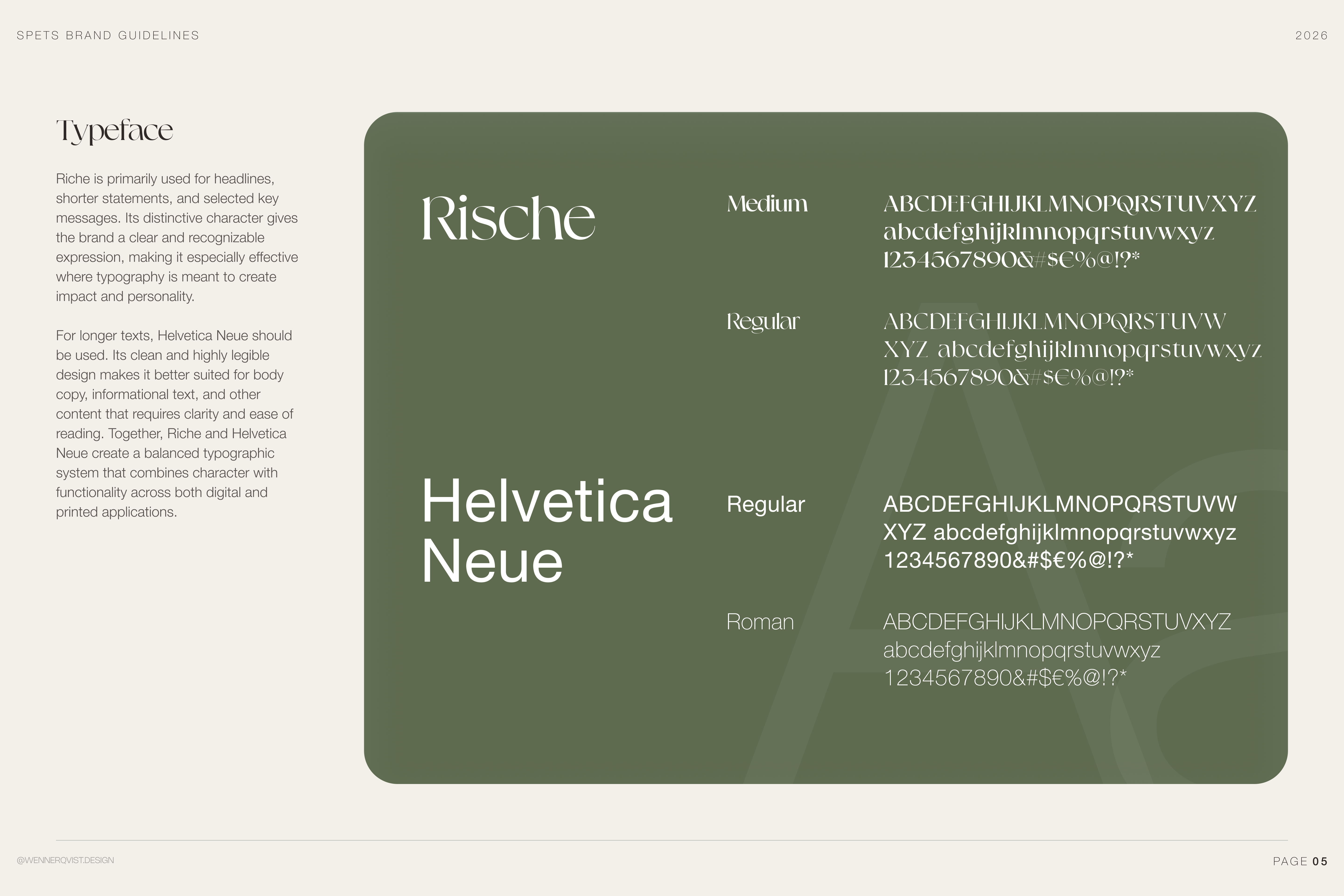
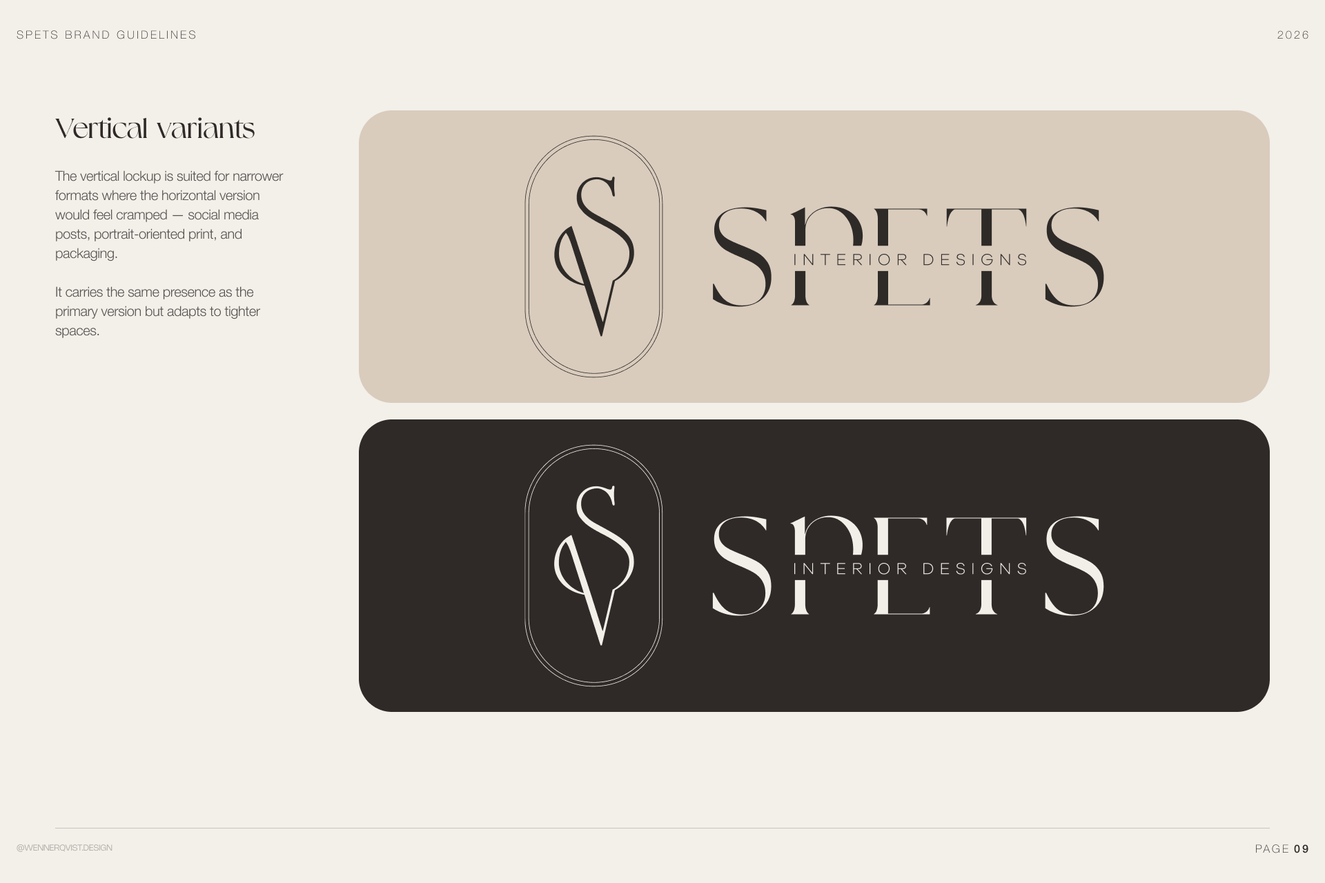
The work focused on creating a visual foundation that feels consistent across different contexts. A simple but recognisable logo system, a restrained palette, and clear typographic principles together shape an identity that is easy to apply and built to last.
The work focused on creating a visual foundation that feels consistent across different contexts. A simple but recognisable logo system, a restrained palette, and clear typographic principles together shape an identity that is easy to apply and built to last.
Context
SPETS works within a space where trust, taste, and attention to detail matter. The visual language therefore had to feel composed and mature, with a soft but confident expression that supports the studio rather than competing with the work itself.
Scope
The project included development of the logo, colour palette, typography, and a concise set of guidelines for how the identity should be applied. The aim was to create a small but solid system — enough to give structure, but still leave room for flexibility.
Tech stack
Illustrator
Figma
Photoshop
ChatGPT
Claude AI
Figma
Photoshop
ChatGPT
Claude AI
Mission
Create a visual identity that reflects SPETS as a contemporary interior design studio — calm, refined, and professional. The goal was to build something that feels credible and elevated, while remaining natural and easy to use across both digital and printed formats.
Challenge
The challenge was not to add more, but to define the right amount. The identity needed to feel distinct without relying on effects or unnecessary decoration. That meant working carefully with proportion, spacing, typography, and colour to create a quieter kind of presence.
Outcome
The result is a restrained and flexible identity with a clear sense of tone. It gives SPETS a more defined visual direction and a practical system that can be used consistently across presentations, documents, and future brand applications.